Animate Your Jetpack Compose UI: A Comprehensive Overview
Animations can be a powerful tool for creating engaging and interactive user interfaces. With Jetpack Compose, creating animations has become easier than ever. In this blog post, we'll walk through the basics of using animations in Jetpack Compose and explore some examples to get you started.


The art of animations bestows a certain vitality and character upon mobile applications and websites, infusing them with a touch of soul. - ChatGPT
In simpler terms, animations are important for improving the user experience of your app. Jetpack Compose provides numerous animation APIs available as composable functions, that utilize lower-level Kotlin Coroutines and suspend functions for smooth and efficient animations. Android docs offer a helpful diagram to help implement these animations.
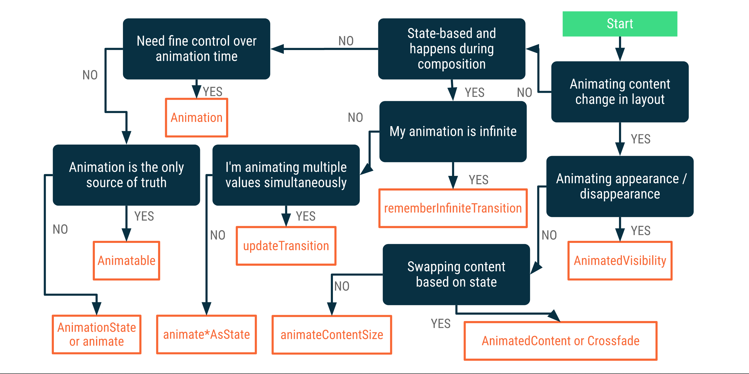
In all seriousness, let's actually understand this diagram.
Note: Blue boxes are use cases for animations, and orange boxes contain APIs that can be used to achieve the required animations.
Note that I've mentioned used an example application to showcase some of the topics. The source code for the same can be found at in the footnotes of this post.
Table Of Contents
- Diagram Breakdown
- Animate Visibility
- Animate*AsState
- Animated Content
- Animated Gesture
- Infinite Transition
- List Animation
- Navigation Animation
- Bouncy Rope
- Lottie
- Conclusion
- Bonus Links
Diagram Breakdown
- If you are animating a composable appearance or disappearance, you use
AnimatedVisibilityAPI. - If you want an animation that repeats infinitely you use
rememberInfiniteTransition, and to have fine control over your animations, use anAnimationsuch asTargetBasedAnimationorDecayAnimation. - If you are animating based on state, use
animateAsState. - If the animation is the only source of truth use
Animatable.
Let's dive deeper into each animation kind!
Animate Visibility
As the name suggests, it's used to animate the appearance and disappearance of the content passed to it.
AnimatedVisibility(
    visible = Boolean,
    enter = EnterTransition,
    exit = ExitTransition,
    modifier = Modifier,
    label = String,
) {
	// content here...
}
By default, content appears in your app with a fade-in and expansion animation, and disappears with a shrink and fade-out animation. However, you can customize these enter and exit transitions to suit your needs.
Animate Visibility lets you combine multiple enter and exit transitions using the + operator, and each can have customized behavior like:
AnimatedVisibility(
        visible = isVisible,
        enter = slideIn(
            animationSpec = tween(
                durationMillis = 1000,
                easing = LinearEasing
            )
        ) {
            IntOffset(it.width / 4, 100)
        } + fadeIn(
            animationSpec = tween(1500)
        ),
        exit = slideOut(
            animationSpec = tween(
                durationMillis = 1000,
                easing = LinearEasing
            )
        ) {
            IntOffset(-180, 50)
        } + fadeOut(
            animationSpec = tween(1500)
        )
    ) {
        // content here...
    }
Animate Visibility has multiple animations to choose from, such as:
- Default Animation
- Fade Animation
- Slide Animation
- Slide Horizontally
- Slide Vertically
- Scale
- Expand and Shrink
- Expand and Shrink Horizontally
- Expand and Shrink Vertically
Here is a video from the sample app showcasing different visibility animations
Animate*AsState
In Compose, anything can be animated. Compose lets you animate any property as state, such as:
- animateDpAsState
- animateOffsetAsState
- animateFloatAsState
- animateColorAsState
- animateIntAsState
- animateSizeAsState
and many more. All you need to do is pass a target value (from - to) and the value change will be animated.
Here is a sample video showcasing different values that can be animated:
Animated Content
AnimatedContent animates its content based on targetState changes. This uses its lambda value as the key to identify the content that's currently shown.
By default, the content fades to the target value but this behavior can be modified by specifying different transitions in transistionSpec parameter. AnimatedContent takes the following parameters:
AnimatedContent(
	targetState = targetState,
	transitionSpec = {
		Custom Animations here...
	},
	modifier = Modifier,
	contentAlignment = Alignment,
	label = String
) {
	// content here...
}
Animated content allows you to animate any content changes but for this example, the app shows a basic animated counter animation and an advanced counter animation:
Basic Counter Animation is, well, pretty basic. For this example we combine multiple Enter & Exit using with infix function.
transitionSpec = {
	if (targetState > initialState) {
	// Enter Transition            Exit Transition
	slideInVertically { -it } with (slideOutVertically { it } + fadeOut())
} else {
	// Enter Transition            Exit Transition
	slideInVertically { it } with (slideOutVertically { -it } + fadeOut())
}Animated Content also offers slideIntoContainer and slideOutOfContainer. These are similar to slideInHorizontally/Vertically and slideOutHorizontally/Vertically -- the only difference is that slideIntoContainer and slideOutOfContainer calculate the slide distance based on the sizes of the initial content and the target content of the AnimatedContent content.
Advanced Counter animation is by sinasamaki, you can check out the source code below to get a deep understanding of the code, the main idea is to split the value and check whether the entire value or a single digit has been updated. Only the updated value is then animated.
Animated Gesture
Building animations and gestures in mobile apps can be an exciting task, but there are several considerations to keep in mind. Firstly, if there is an ongoing animation, it should be interrupted when a touch event occurs. Secondly, user interaction should always be given the highest priority.
We can do this using the pointerInput modifier. In this example we are animating the offset of an image based on tap position:
val offset = remember { Animatable(Offset(0f, 0f), Offset.VectorConverter) }
Column(
	modifier = Modifier
    	...
        .pointerInput(Unit) {
        	coroutineScope {
        	while (true) {
            	// Detect a tap event and obtain its position.
                val position = awaitPointerEventScope {
                	awaitFirstDown().position
                }
                launch {
                    // Animate to the tap position.
                    offset.animateTo(
                    	position,
                        animationSpec = ...
                    )
            	}
            }
    	}
     },
) {
	...
    CatImage(
    	size = 150.dp,
        modifier = Modifier
        	.offset { offset.value.toIntOffset() }
            .clip(CircleShape)
	)
}
Here we use Animatable to represent the offset position of the image but since modifying the offset takes IntOffset instead of Offset we do the conversion using:
private fun Offset.toIntOffset() = IntOffset(x.roundToInt(), y.roundToInt())
and simply animate the transition using animateTo. Here is a sample video:
pointerInput also has many use methods few very useful ones are
- detectTapGestures
- detectDragGestures
- detectTransformGestures
using detectTapGestures we can detect Tap, DoubleTap, LongPress and Press. detectDragGesture gives us control over onDrag, onDragStart, onDragEnd, onDragCancel.
onDragStart is called when the touch slop has been passed and includes an Offset representing the last known pointer position relative to the containing element. onDragEnd is called after all pointers are up and onDragCancel is called if another gesture has consumed pointer input, canceling this gesture.
detectTransformGestures is used for detecting rotation, panning, and zoom. Once the touch slop has been reached, the user can use rotation, panning, and zoom gestures.
Infinite Transition
infiniteRepeatable is used when we want the animation to animate an infinite amount of times. we can achieve using infiniteRepeatable animation spec. One unique variable we can modify is repeatMode -- this basically tells compose what to do once the animation ends. RepeatMode.Restart restarts the animation again from start, while RepeatMode.Reverse reverses the animation. For this example, we are animating the rotation of our fan image.
List Animation
List Animation is a simple yet effective way to add animation to your app. Although it may not be as advanced as RecyclerView, it can still get the job done. In this example, we are animating the placement of list items using the animateItemPlacement modifier on refresh. This allows us to add an animationSpec to customize the animation. To implement this, all we need to do is add the pullRefresh modifier to the layout.
Note: adding refresh indicator is optional
Navigation Animation
Note:
As of writing this blog Animated Navigation is a part of accompanist libraries and is marked as experimental which means they could change anytime so keep an eye on the accompanist page to stay updated.
Compose makes navigation animations very simple. To get started first we need to add animated nav dependency:
implementation "com.google.accompanist:accompanist-navigation-animation:<version>"
now, the process of navigation stays the same, but we can instead of NavHost we use AnimatedNavHost and similarly instead of rememberNavController(), we use rememberAnimatedNavController().
AnimatedNavHost adds multiple options to animate transitions like enterTransition, popEnterTransition, exitTransition and popExitTransition. Here we can also leverage special animations like slideIntoContainer and slideOutOfContainer which gives us access to initialState and targetState.
val animatedNavController = rememberAnimatedNavController()
AnimatedNavHost(
    navController = animatedNavController,
    startDestination = Route
) {
    composable(
        route = Route,
        enterTransition = {
            fadeIn(tween(durationMillis = 400, easing = LinearEasing))
        },
        exitTransition = {
            fadeOut(tween(durationMillis = 400, easing = LinearEasing))
        }
    ) {
        Layout Here...
    }
}enterTransitioncontrols whatEnterTransitionis run when thetargetStateNavBackStackEntryis appearing on the screen.exitTransitioncontrols whatExitTransitionis run when theinitialStateNavBackStackEntryis disappearing from the screen.popEnterTransitiondefaults toenterTransition, but can be overridden to provide a separateEnterTransitionwhen thetargetStateNavBackStackEntryis appearing on the screen due to a pop operation (i.e.,popBackStack()).popExitTransitiondefaults toexitTransition, but can be overridden to provide a separateExitTransitionwhen theinitialStateNavBackStackEntryis disappearing from the screen due to a pop operation (i.e.,popBackStack()).
Bouncy Rope
Bouncy Rope is a straightforward physics-based animation that showcases the capabilities of Compose's built-in animation APIs. This example is implemented using canvas and has three key points: start coordinates, mid coordinates, and end coordinates. In this figure, 'coordinates' has been shortened to 'cords'.
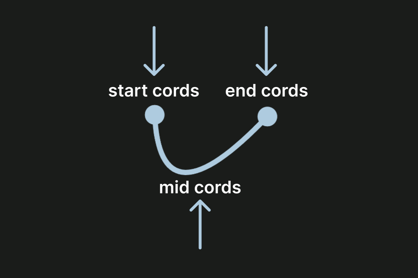
The start coordinates and end coordinates are predefined values that determine the exact positions of the rope's start and end points. The mid coordinates are then calculated based on these values.
    var startCoOrdinate by remember {
        mutableStateOf(Offset(0f, 200f))
    }
    var endCoOrdinate by remember {
        mutableStateOf(Offset(300f, 200f))
    }
    val midPoint by remember {
        derivedStateOf {
            val distance = (endCoOrdinate.x - startCoOrdinate.x)
            Offset(
                (endCoOrdinate.x - startCoOrdinate.x) / 2f,
                endCoOrdinate.y + distance
            )
        }
    }
We use derivedStateOf because it creates a state object that prevents multiple calculations of the operations that are passed to it. Once we have the mid coordinates, we can animate its value change using animateOffsetAsState(), and add a spring animation to give it a bouncy effect.
    val midPointAnimated = animateOffsetAsState(
        midPoint,
        animationSpec = spring(
            dampingRatio = Spring.DampingRatioHighBouncy,
            stiffness = Spring.StiffnessVeryLow
        )
    )
This Bouncy Rope animation is a modified version of Rebecca Franks's original bouncy rope and more information can be found here.
Here is the modified bouncy rope in action.
Lottie
While built-in APIs are useful for animating in Compose, they are not the only option available. Lottie and Rive make it easy to implement complex, interactive vector animations. Both Lottie and Rive come with editors that allow you to customize your animations to your liking. Lottie also has an editor that can be used to tweak animations without the need for Adobe After Effects. On the other hand, Rive comes with an editor written in Flutter that lets you build your animations from scratch.
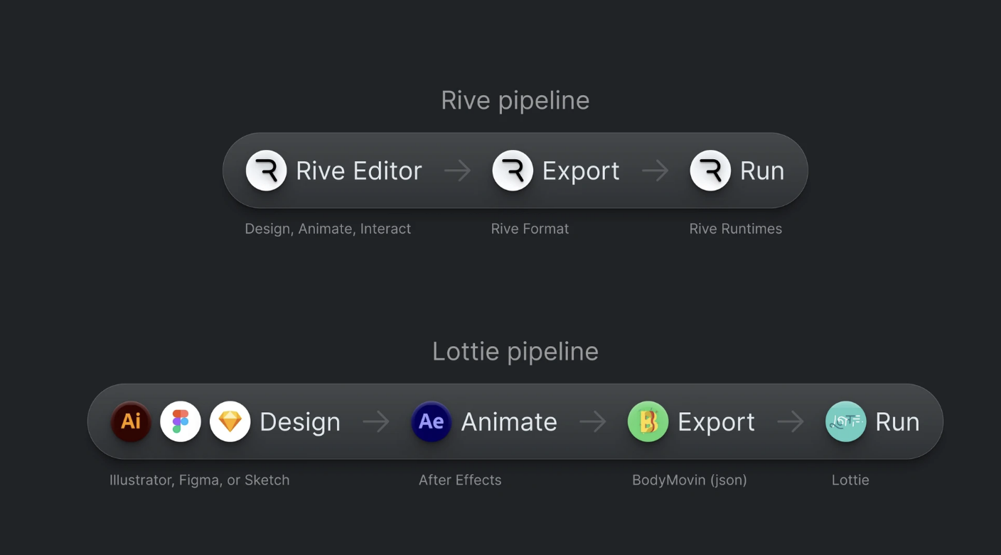
While Rive makes it easy to implement interactive animations, one caveat is that Rive does not yet have support for Jetpack Compose.
Conclusion
In essence, as an app developer, adding animations to your app can greatly enhance its user-friendliness. Personally, I have been developing apps for a while now, and I find working with animations to be particularly enjoyable. Thanks to Compose, implementing animations has become much easier. Therefore, I highly recommend integrating animations into your app to enhance the overall user experience. When creating animations, it is important to consider timing. With that said, happy coding! :)
Bonus Links
Example app source code:
 MadFlasheroo7
Offical documentation:


Learn more about canvas in Jetpack Compose:

New to Kotlin?
Get to learn about coroutines:

Wanna try something cross-platform?