Constraint Layout - Jetpack Compose
Learn more about how you'd go about using a constraint layout when building applications with Jetpack Compose to create layouts with more control and concise code.


The Best and most fun part of building Android apps for me was building beautiful UI and one of the reasons was constraint layout in XML, like me it was also a starting point for a lot of new Android developers and now modern Android development focus has shifted to a better and cleaner way of building UI using jetpack compose and what makes it fun is building UI in Kotlin.
The primary way of building UIs in compose is using layouts like Column, Row, and Box but have you ever gone on the dribble to find a really pretty design but you get worried about how would you achieve it using Box, Column, or Row? and worried that your code might start looking messy?
Column() {
  ...
  Row() {
    ...
    Column() {
      ...
      Column() {
        ...
      }
    }
  }
}
To solve that we have constraint layout in compose.
Constraint layout in compose solves the same issue that it used to solve in XML that is making code more readable and getting rid of nested layouts. Unlike Column and Row where the UI components are placed in a specific order in constraint layout UI components can be placed relative to each other with a set of guidelines, barriers, or chains (more about them later).
Getting Started
Now enough talking and let's code, start by adding the dependency.
implementation "androidx.constraintlayout:constraintlayout-compose:1.0.1"In constraint layout, the common way of building UI is by creating references.
ConstraintLayout() {
  val (ref1, ref2) = createRefs()
  Text(
    ...,
    Modifier.constrainAs(ref1) {}
}
By default constraint layout stacks UI like Box since we havent passed any constraints. Now to constraint UI components we first need to create references, there are two ways to create references with createRefs() and createRefFor():
createRefs()
ConstraintLayout() {
  val (ref1, ref2) = createRefs()
  Text(
    ...,
    Modifier.constrainAs(ref1) {}
}
createRefFor()
val constraintSet = ConstraintSet {
  createRefFor("button")
  createRefFor("text")
}
ConstraintLayout(
  constraintSet = constraintSet
) {
  Button(onClick = { /*TODO*/ }, modifier = Modifier.layoutId("button")) {
    Text(text = "button")
  }
  Text(text = "text", modifier = Modifier.layoutId("text"))
}
Passing ConstraintSet{} exposes us to multiple additional parameters:
ConstraintLayout(
  constraintSet = constraintSet,
  optimizationLevel = Optimizer.OPTIMIZATION_STANDARD,
  animateChanges = false,
  animationSpec = ...,
  finishedAnimationListener = {}
) {...}
In the official words,
you might want to change the constraints based on the screen configuration, or animate between two constraint sets.
Passing multiple constraint sets allows you to animate the constraint changes and you can read more about Optimizer here.
Now that we have created our references we have to declare which variable is referencing which composable for that we use constraintAs() {} modifier extensions, here we have to pass the reference, now what's remaining is a way to tell constraint layout where and what to constraint it to, here is how to do it:
ConstraintLayout() {
val (button, text) = createRefs()
Button(
modifier = Modifier.constraintAs(button) {
// constraint set here
}
) {...}
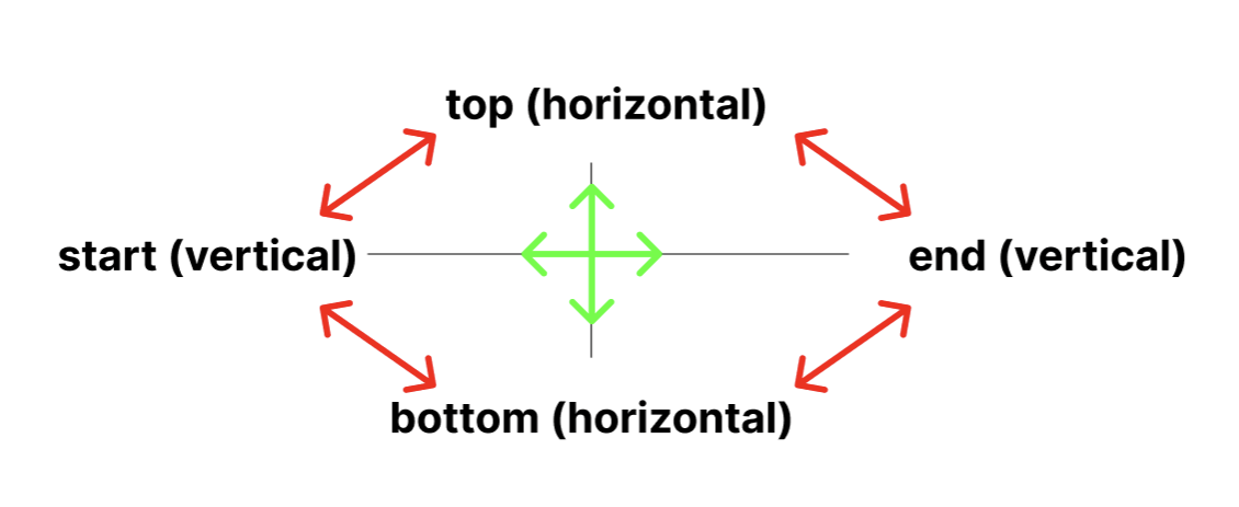
}Here we have two anchor points Horizontal and Vertical. Horizontal anchor points are for top and bottom, and Vertical anchor points are for start and end. Anchor points basically tells you where it can be constrained.
Here is a simple diagram to explain constraint sets:
You can proceed to constraints like this:
ConstraintLayout() {
  val (button, text) = createRefs()
  Button(
    modifier = Modifier.constraintAs(button) {
      start.linkTo(...)
      end.linkTo(...)
      top.linkTo(...)
      bottom.linkTo(...)
    }
  ) {...}
}
it also gives us flexibility to adjust height and width using constraints using
height = Dimension.fillToConstraints
width = Dimension.fillToConstraints
Guidelines
Guidelines are like an invisible helper that helps you constrain to a guideline at a certain dp or percentage.
ConstraintLayout() {
  val (button, text) = createRefs()
  val startGuideline = createGuidelineFromStart(10.dp)
  Button(
    modifier = Modifier.constraintAs(button) {
      start.linkTo(startGuideline)
      end.linkTo(...)
      top.linkTo(...)
      bottom.linkTo(...)
    }
  ) {...}
}
Creates an invisible anchor point, and the horizontal and vertical anchor rule applies to guidelines as well.
Barriers
Barriers refer to multiple widgets as input and helps you create a responsive UI this video explains how barriers help make a more responsive UI.
val topBarrier = createTopBarrier(button, text)Now we can proceed to link our anchors to this barrier the same as guidelines, the key difference is guidelines are like a set of invisible walls that our compostable can be constrained to whereas barriers are like reference points (still invisible) that our composables link to make more responsive UI.
Chains
Chains basically group the constraints either vertically or horizontally
     val (btn1, btn2, btn3) = createRefs()

        createHorizontalChain(
            btn1, btn2, btn3,
            chainStyle = ChainStyle...
        )
Chains come in three different types of chain styles:
ChainStyle.Spread: Space is distributed evenly across all the composables, including free space before the first composable and after the last composable.

ChainStyle.SpreadInside: Space is distributed evenly across the all composables, without any free space before the first composable or after the last composable.

ChainStyle.Packed: Space is distributed before the first and after the last composable, composables are packed together without space in between each other.

Conclusion
Well, this was constraint layout in Jetpack Compose, when should you actually use it? only when needing to build complex UI and still maintain code readability but if you remember we also had motion layout in XML which made animations easy too only if that was available in compose 😉
Until then keep composing :)
Part 2
Coming Soon...
Nudge me here 😉
Bonus links
Publish your Android Library to maven central

Animate your compose UI

Learn about open-source licenses

Learn about coroutines here