Getting Started with Jetpack Compose
Jetpack Compose is a modern UI toolkit by Google which replaces traditional XML layouts with a way to do it using Kotlin, which simplifies and accelerates UI development with less and maintainable code, allowing us to make powerful and beautiful apps in lesser time.

Jetpack Compose is a modern UI toolkit by Google which replaces traditional XML layouts with a way to do it using Kotlin, which simplifies and accelerates UI development with less and maintainable code, allowing us to make powerful and beautiful apps in lesser time. It gives direct access to android platform APIs and support for google's latest Material You design system – creating UIs has never been easier.
1) Setting up Development Environment
To get started with compose, you first need to get the latest stable version of Android Studio here. When creating a new project, you will get a new template for an empty compose activity, click next and name your project.
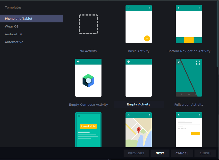
2) About Composables
At first, you will be greeted with:
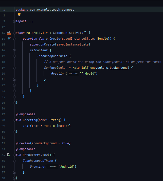
Let's have a closer look –

in Compose, everything is a Composable, and is annotated by
@Composableand to display a text we call a Text() element. A tip to always remember is
Composable functions can only be called from other composable functions.
compose uses the Kotlin compiler plugin to convert composable functions to the app's UI element.
3) Previewing Composables
Any composable function can be previewed by annotating it with:
@Preview()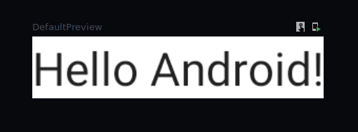
Preview has multiple parameters that can be passed to it, like:
@Preview(
    showBackground = Boolean
    showSystemUI = Boolean
    apiLevel = Int
    locale = String
    uiMode = Int
    device = String
)
and many more.
Note: If preview is not visible, try rebuilding the project
4) About Layouts
In Compose by default all elements stack on each other, for example:
@Composable
fun Greeting() {
    Text("First Text")
    Text("second Text")
}
to overcome this, compose has standard layouts such as Column, Row, Box and BoxWithConstraint.
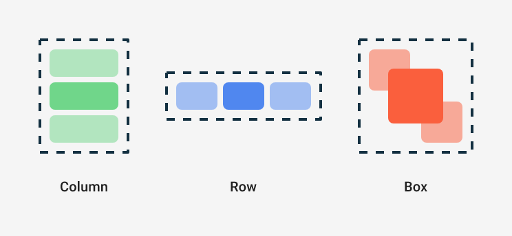
Column places items in vertical arrangement as such:
@Composable
fun Greeting() {
    Column() {
    	Text("First Text")
        Text("second Text")
    }
}
Row places items in horizontal arrangement as such:
@Composable
fun Greeting() {
    Row() {
    	Text("First Text ")
        Text("second Text")
    }
}
Box places items on top of each other. Box also supports configuring specific alignment of the elements it contains (source).
@Composable
fun ArtistAvatar(artist: Artist) {
    Box {
        Image(/*...*/)
        Icon(/*...*/)
    }
}
5) Modifiers
Using modifiers you can decorate and augment a composable. It lets you modify and configure your composable element. Modifiers are standard Kotlin objects, it makes easier to make element interactive and have interactions like clickable, draggable, zoomable etc. You can chain multiple modifiers according to your product's needs (source).
@Composable
fun ArtistCard(
    artist: Artist,
    onClick: () -> Unit
) {
    val padding = 16.dp
    Column(
        Modifier
            .clickable(onClick = onClick)
            .padding(padding)
            .fillMaxWidth()
    ) {
        Row(verticalAlignment = Alignment.CenterVertically) { /*...*/ }
        Spacer(Modifier.size(padding))
        Card(elevation = 4.dp) { /*...*/ }
    }
}
6) Theming
Compose ships with Google's material theming design system which makes your app's UI look consistent, you can edit and customize your theme from:
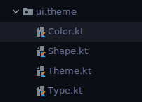
Compose aims to completely replace XML. Here you can define your brand colors, shapes, typography ,etc. We can access system APIs using accompanist – it's a set of libraries that bring features to compose which are not officially available yet for compose like insets, system bar controllers and many more. we can provide different color palette
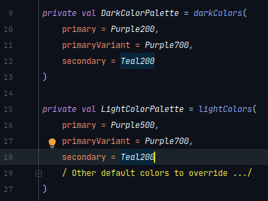
You can read more about theming in compose here.
Conclusion
There's still much more to learn about Compose, since it's the future for building beautiful UIs in Android, and with the stable update 1.0, Compose is now officially production ready. So, get started with compose through Google's Codelab for Compose, which has multiple code samples for adding animations, navigation component and much more.
